Traditionally, packaging designers were responsible for the graphics and structure of the package, while advertisers and marketers handled the rest of the branding: ad campaigns, slogans, promotions. That divide is quickly being erased.
“Packaging design is the profession that understands how to capture the brand narrative and express it to a consumer audience quickly and effectively,” Marianne Klimchuk, professor of Packaging Design, says. “Very often, we are now involved in motion graphics, in social media, in all the different ways that the brand connects with consumers, on pack and off.”
The reason for this shift, she posits, is that consumers now encounter brands well before they walk into a store. Sometimes this first encounter—this “moment of truth,” as Klimchuk puts it—happens on social media, sometimes on an e-commerce site. (While traditional advertising has long exposed consumers to products before they shop, she says relatively few brands could afford that.) This is especially true for Gen Z, an essential demographic for brands that want to stay youthful and relevant.
This evolving role for the packaging designer is perhaps nowhere more exemplified than at PepsiCo, a brand that Klimchuk calls “the top of the top” for their industry-leading investment in design. And the company has continually recognized the excellence of FIT’s Packaging Design program, hiring numerous grads for key positions.
The following case studies by alumni working at PepsiCo reflect the brand’s innovative stance and show what packaging designers do today.
“Packaging is not just packaging anymore,” says Daniela Maldonado ’14, senior design manager for the PepsiCo Design and Innovation Center in Los Angeles. “We’re really shaping brands that can change the culture.”
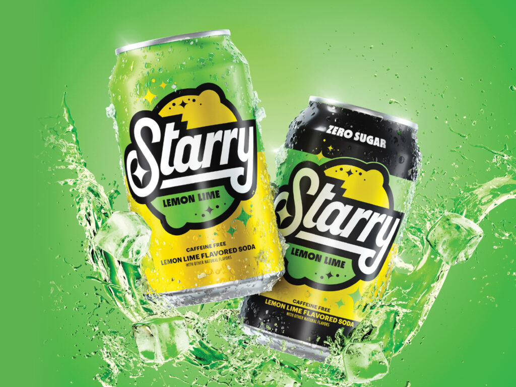
LAUNCH: STARRY LEMON LIME SODA
Daniela Maldonado
_
Packaging Design ’14
Senior Design Manager, PepsiCo
Design and Innovation Center
“a PICK-ME-UP WHEN LIFE FEELS LIKE A LOT”
Maldonado is part of a Los Angeles–based innovation team that incubates and launches beverage brands, often in new categories for PepsiCo like mixers (Unmuddled) and mood enhancement (soulboost). When she joined the team in January 2022, moving from a Miami-based position doing beverage design for the Latin America region, they were creating a cool replacement for the perennially underperforming lemon-lime soda, Sierra Mist.
“We wanted to create a unique offering that connected with Gen Z adults,” Maldonado says, “a brand that would generate love and recognition, not just this thing you find in convenience stores when the other one’s not available.”
Sierra Mist had scored low on flavor, so PepsiCo R&D formulated a new lemon-lime soda with a crisp, citrusy flavor that beat Sprite, Coca-Cola’s category-dominator, in blind taste tests.

Finding the perfect name was a major challenge. The soft drink’s ethos is “a pick-me-up when life feels like a lot,” a sentiment geared toward Gen Z adults, who have grown up in an increasingly chaotic environment with an uncertain future. Not only did the name need to resonate with that ethos, feel distinctive, sound like a delicious beverage, and test well with focus groups, it also had to be available for copyright. The winning name was Starry. The team felt it sounded bright, optimistic, and imaginative.
Starry would be sold in multiple sizes of cans and bottles, and the team designed the packaging for all of them. The 12-ounce can is the iconic format, with the most room for visual branding, whereas the label on the 20-ounce bottle is more space-challenged.
Since the packaging designs were just one part of a complete branding and marketing system, the Design and Innovation team also brainstormed ideas for introducing Starry to the world.
They wanted the brand to be irreverent and cool, and they looked to fashion, particularly streetwear, for inspiration. Brands like A Bathing Ape, Supreme, and Louis Vuitton were using cartoon characters on their clothes, and Gucci did a fashion collection with Snoopy, so the Design and Innovation team created brand mascots to bring Starry to life.
Mascots Lem and Lime would appear in advertisements and other brand activations. The team thought through not just the fruits’ physical features (Lem is a lime in a lemon costume, and Lime is a lemon in a lime costume) but also their personalities and the way they move and act (Lem is more relaxed than Lime).
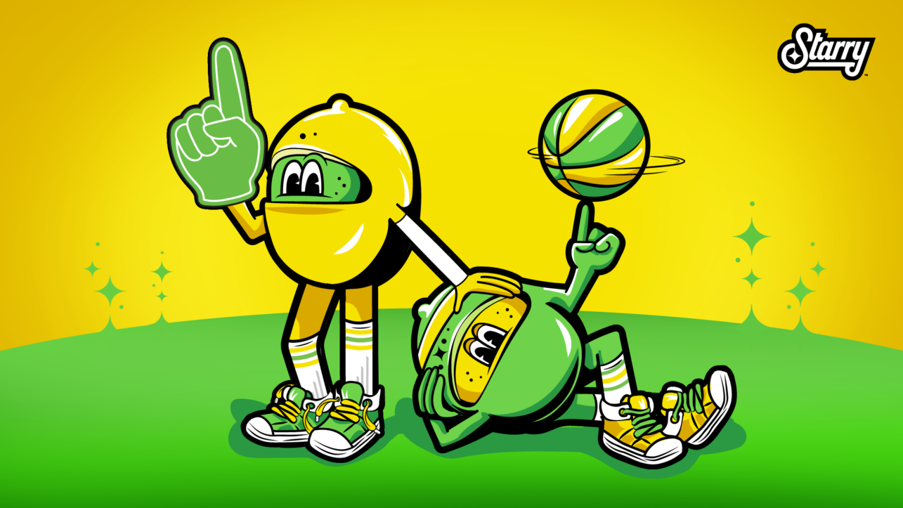
Marketing decided that Starry’s first big partnership would be with the NBA All-Star Game in February 2023, a month after cans hit shelves. Maldonado’s team worked with PepsiCo’s sports marketing team to ensure that this partnership would feel authentic and fully considered. Starry sponsored the three-point contest, All-Star Game attendees got to taste the soda, and the TV broadcast introduced Lem and Lime to millions of basketball fans.
Many groups within PepsiCo came together to launch Starry: marketing, design, R&D, food service, sales, and retail, to name a few. But Maldonado says her collaborative team was crucial to the new brand’s success. “It all came together because we were constantly talking to each other. We were able to create and launch this brand so quickly because we were working in the innovation hub.”
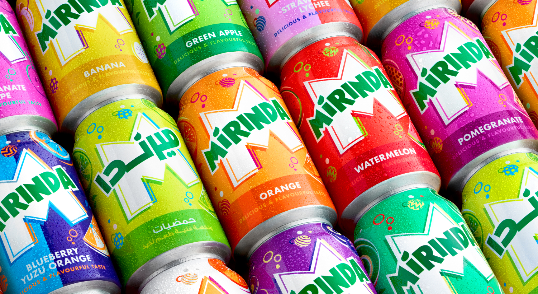
Rebrand: Mirinda
Corinna Hutter
_
Packaging Design ’13
Senior Designer, International
Beverages, PepsiCo Global
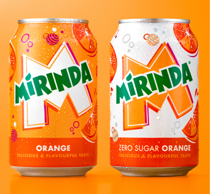
Mirinda, a Spanish soda brand founded in 1959 and acquired by PepsiCo in 1970, isn’t sold in the U.S. but is uber-popular overseas, with almost 50 fruit flavors across different markets worldwide. Corinna Hutter, who was hired for PepsiCo’s international beverage team in Dublin in 2022, helped steer a rebrand to target Gen Z adults.
The previous packaging, which launched in 2015, was a bit monotone, and it was getting lost on the shelf. The original Mirinda can, which debuted back in 1959, featured a graphic “M,” and Hutter’s three-person design team focused the new logo around that letter. The new “M” introduces a pop of white that contrasts with the bright colors representing the fruit flavors. The white also links the design back to the previous iteration, which had a white circle behind the logo.

The team also brought in accent colors to help the labels stand out and to modernize them further. Orange, the most popular flavor in most markets, is still an orange-colored can but now has fuchsia highlights, and the purple pomegranate can includes a touch of yellow. The rich green used for the lettering of “Mirinda” was punched up slightly from previous iterations.
Hutter points out that the Mirinda letterforms were formerly a bit disjointed and wacky, and her team reined them in to modernize them. “Throughout the 2000s, you saw energetic typography as if to say, ‘This is a fun, creative brand!’” she explains. “Now you don’t have to be as over-the-top.”
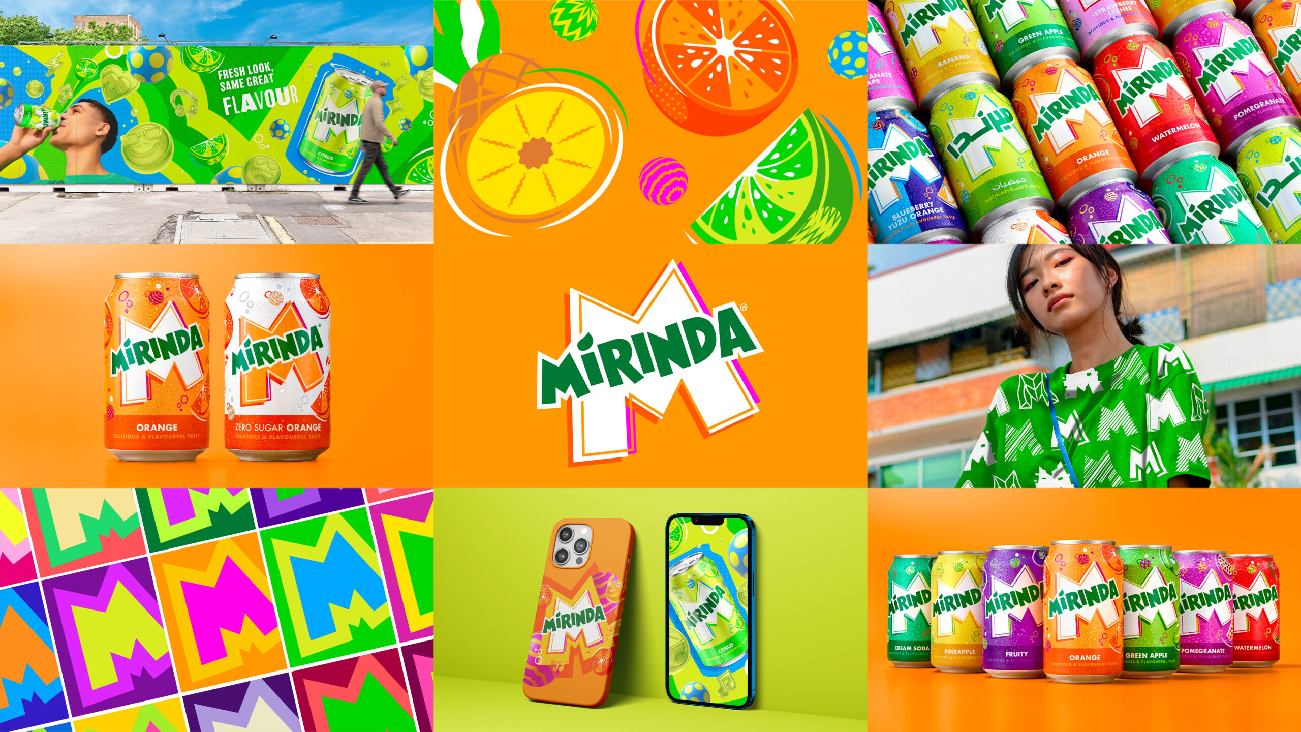
The team added fizzy bubbles that zipped around the Mirinda logo and developed more than 25 complementary fruit illustrations that matched the vibrant new look. As with every other design decision, obsessive care went into the smallest details: How thick should the rinds be? What rind texture matched each fruit: zigzags, dots, or another pattern? Where should the motion lines be placed? Because all the packaging designs were interrelated, each decision affected every product format.
The can design was part of a larger rebranding. Mirinda’s brand book, finalized in early 2022, presents visuals and guidelines for in-store displays, billboards, commercials, and social media campaigns. Mirinda photography, for example, should have a raw, real quality, and the actors for TV spots should “own their own creativity and personality, making their own ‘M-pact,’” Hutter says.
She is proud of what the team accomplished. “I’d never tried Mirinda or been exposed to it,” she says. “Seeing these new cans, I would want to collect them and try all the flavors.”
campaign: PopFizzAhh
Hayley Shore
_
Packaging Design ’13
Design Manager
PepsiCo Europe
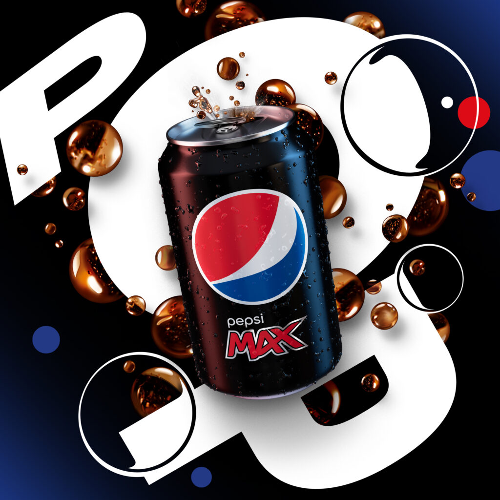
In 2022, after a two-year stint at PepsiCo Global based in Dublin, Hayley Shore relocated to PepsiCo’s London office. One of her first projects was a billboard campaign for Pepsi called PopFizzAhh.
“We were looking for a way to celebrate summertime and Pepsi Max but introduce a more emotive expression of the brand into the U.K. market,” Shore says.
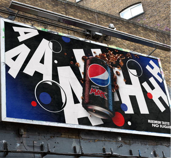
The target for this emotional advertising was adult Gen Z “cola switchers”: those who didn’t drink cola but could become interested through advertising. The most influential audience in terms of purchasing power, Shore says, is “Mom at the shop picking up Pepsi Max for the family”—but targeting that audience often relegates the advertising to the functional space, that is, focusing on product information.

“PopFizzAhh was about celebrating the ritual of drinking a can of Pepsi,” she says, “from the pop of the cap … to the fizz that appears in the can … to that sip moment.”
Most soda ads focus on the can and the splash of the beverage. This campaign was typographic, with letterforms crafted to represent feelings. “Pop” explodes onto the billboard, “fizz” sizzles with a string of z’s, and “aah” slides out like a satisfied sigh.
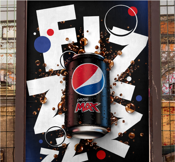
Also, soda ads typically include a tagline—recent Pepsi Max slogans include “best taste, no compromise,” and “maximum taste, no sugar”—but the PopFizzAhh billboards minimized the words to focus on the images, which Shore describes as more like artworks than commercial visuals. Shore and one other designer carefully rendered every cola droplet and arranged them around the letterforms. “We gave a lot more consideration to every aspect.”
Billboard advertising—referred to as “out of home”—can’t take too many risks because billboards can’t easily be taken down. “Social is a space where you can play the most, because it’s the least permanent,” Shore explains. “If it gets a negative response, you can just delete it.”
Packaging is meant to be evergreen because it represents the core values of the brand and serves as the foundation for everything else. In the U.K., limited-edition cans appear only during major football (read: soccer) events. In other words, Shore is a packaging designer but rarely touches packaging.
“Our can is iconic,” she says, “but we are able to play with everything around it.”
Using location data about foot traffic and demographics, the design team worked with the marketing team to identify billboard locations in cities throughout the U.K. where young professionals would encounter them. For maximum impact, they chose large billboards, including a 57-by-22-foot 3D sign at an upscale shopping center in East London. The 3D sign combines two LED images to create the illusion of depth: The can seems to jump off the screen.
Also, small posters that alternated among “pop,” “fizz,” and “ahh” lined the escalators of the London Underground.
As a result of the campaign, Pepsi Max beat out its competitors in the amount of positive online buzz, including the number of people who recommended the drink. “We made a measurable, direct impact on the market,” Shore says. “And we did it with cola art.”