News
ARE INFOGRAPHICS BIASED?
Kyunghee Pyun, associate professor of Art History
As a scholar of the history of collecting, I have paid close attention to world expositions from the 19th century. These world’s fairs were crucial opportunities to introduce non-Western art and culture to European audiences and then to Americans. A 2023 exhibition at the Cooper Hewitt, Smithsonian Design Museum called Deconstructing Power: W. E. B. Du Bois at the 1900 World’s Fair inspired me to launch a new research project.
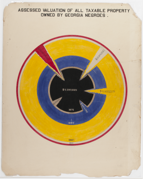
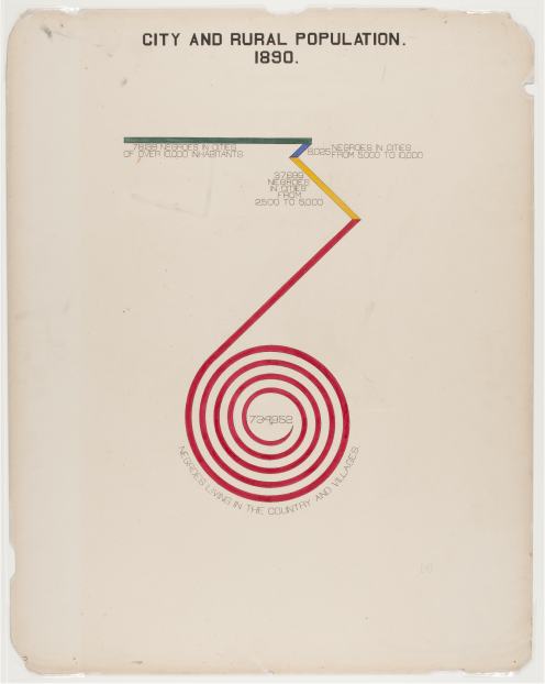
For the 1900 world’s fair, in Paris, American civil rights activist and sociologist W. E. B. Du Bois and his students at Atlanta University created 63 hand-drawn infographics demonstrating the social progress of Black Americans over three decades. These data visualization posters incorporated graphic design so modern that it shocked me.
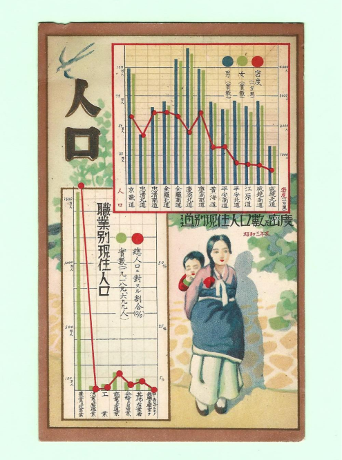
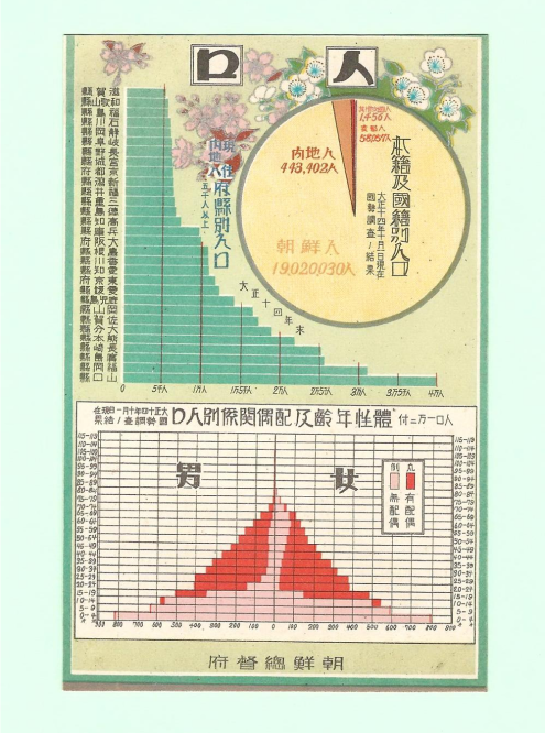
Around the same time, while researching my upcoming article on labor in the Korean textile industry for the Journal of the Royal Asiatic Society, I came upon postcards featuring infographics created by the Japanese colonial government in the 1920s to ’40s.
Korea was a Japanese colony in the early 20th century. From 1910 to 1945, there was no mention of Korea on the world map; Koreans were part of the Empire of Japan and subject to exploitation. On the postcards, sophisticated pie charts and bar graphs deceptively illustrate dazzling progress with “objective” statistics to validate Japan’s imperial expansion and falsely show that it was bringing enlightenment to its colonies.
The cards also show subtle disdain for folkloric and cultural customs, as rural Koreans were depicted in shabby, ethnic clothing or as drunkards or fools.
In the 1930s, the journalist and historian Yi Yeoseong exposed the truth behind the statistics. For example, Yi pointed out that the growth of the Korean population and industries they worked for (see illustration) were not the result of the colonial government’s efficient management and scientific techniques, but because the land was ruthlessly exploited and taxed by the Empire of Japan.
The depiction of data reflects the intent of the presenter. Du Bois’ graphics showed the progress of African Americans after the Civil War despite persistent racism in many parts of the country. The Japanese used seemingly objective data visualizations to justify colonial governance and implicitly emphasize “uncivilized” aspects of ethnic groups under its authority. As I often point out in my classes, infographics leave much room for interpretation and contextualization.
Kyunghee Pyun is an associate professor of art history. Her scholarship focuses on the history of collecting, reception of Asian art, and intersectionality of art and technology, and industrial history. Du Bois’ posters inspired her to include data visualization and pioneering graphic designers from the late 19th to the late 20th century in her research. She received a fellowship from the Korea Foundation to continue the project in South Korea in 2024.