MoMA PS1 and in two Whitney Biennials. “There are ups and downs, but artists keep going.”
The faculty artists featured here have had many ups. They’ve rubbed elbows with Warhol and Lichtenstein and worked with artists like ’70s wunderkind Nancy Graves and renowned fashion illustrator Kenneth Paul Block. Their work has won awards, appeared in shows all over the world, and been showcased in books. Several have published books of their own.
There are also the inevitable downs—creative lulls, lack of funding, rejection. But they do keep going. It’s not hard to understand why. “It’s like breathing,” says Ron Amato, professor of Photography. “I’m driven to do it whether it sells or not.” Visibility is important too, but it’s not always about recognition. “I like when people look at my work long enough to draw from it and interpret it,” says Sue Willis, adjunct associate professor of Fine Arts.
These artists are committed not just to creating beautiful work, but to educating the next generation at FIT. They get satisfaction from watching students go on to fulfilling careers. “I love seeing them getting really great jobs,” says Karen Scheetz, associate professor of Fashion Design.
It’s even better when teachers get to see their former students in action. “My reward is taking students on a field trip to a company, and someone working there says, ‘You were my teacher. I use what you taught me every day,’” says Ellen Oster, adjunct assistant professor of Textile/Surface Design and recipient of a 2018 SUNY Chancellor’s Award for Excellence in Teaching. “It’s important to me to give tools to people”—tools to pursue their vision and remain resilient.
Amato agrees. “I want to empower students to go forward bravely with all that they do,” he says.
ERIC VELASQUEZ Illustration
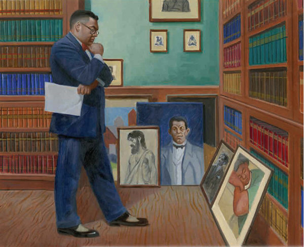
Pictured at the top is Arturo Schomburg, Afro-Puerto Rican scholar and namesake of Harlem’s Schomburg Center for Research in Black Culture, examining possible acquisitions. A teacher once told him that black people had no history or heroes—so he dedicated his life to documenting what others ignored. He collected the artwork, manuscripts, and other black history artifacts that formed the basis of the center, a research unit of the New York Public Library.
A similar dedication drives Spanish Harlem native Eric Velasquez, adjunct instructor of Illustration. “Growing up, there were no books with kids that looked like me,” he says. “The lack of representation had an effect.” He’s spent more than 30 years illustrating children’s books (three of which he also wrote) that often highlight black history and heroes.
His subjects include Matthew Henson, the first black Arctic explorer; Alice Coachman, the first black woman to win an Olympic gold medal; and Muhammad Ali. Velasquez’s work on the boxer landed him an interview on C-SPAN2’s Book TV. This illustration is from Schomburg: The Man Who Built a Library, which won a We Need Diverse Books Walter Dean Myers Award for Outstanding Children’s Literature. Released in 2017, it took 10 years to get published—but Velasquez always kept his goal in mind.
“I want to inspire children of African descent to be artists and storytellers,” he says. And maybe even Schomburgs.
ELLEN OSTERTextile/Surface Design
Magicians never reveal their secrets, and neither does Ellen Oster. She won’t disclose the inspiration behind the work pictured below to the general audience (and this writer has promised not to tell). “I don’t want people to know what the special ingredient is,” she says. The self-professed foodie does drop one hint—the piece is called Panned.

The work itself is something of an illusion. It looks like a watercolor, but it’s actually a digitally manipulated image. She took a photograph of the mystery subject and added color, texture, and lines.
Oster, Textile Design ’79, has spent her professional life combining art and technology. While pursuing her degree at FIT, she mastered one of the earliest computer design programs. She made a career out of providing design software training for companies like Ralph Lauren and Komar while also working as a freelance textile designer and teacher. “It’s my right and left brain staying balanced,” she says.
This balance is present in her artwork. About half is done in Photoshop, and the rest in pastels. And while she’s an expert at demystifying complex computer programs for others, she appreciates the challenge of working with analog tools. “Pastels are not very forgiving,” Oster says. “You make a mistake and you’re done.”
RON AMATO Photography
“It’s a myth to say artists have it all figured out before they make the work,” Ron Amato says. Much of his career has been influenced by the unexpected, or even the seemingly impossible.

He spent five years shooting for magazines like Men’s Health, but wanted to find his own voice as a gay artist. “I grew up in a repressive Catholic environment in a tough neighborhood in Brooklyn, and coming out seemed not doable,” he says, “so my personal work centers around my sexuality.”
Amato’s 2000 solo exhibition at Richard Anderson Fine Arts showcased erotic portraits of him with partners. “That was my declaration, planting my flag,” he says. More recently, he published a photo series and book, The Box, which won the 2017 American Photographic Artists Award for Outstanding Photographic Series. It started out as an examination of a box’s role: It can support you, or it can confine you. But after a couple of shoots, “a narrative revealed itself,” he says. “It chronicles my life as a gay man, from isolation to empowerment.”
The above image is Amato’s response to the 2016 presidential election. It’s part of his Gay in Trumpland series, on view at Provincetown’s CUSP Gallery this summer. The portrait is of an interracial couple, completely covered and standing apart. “They’re holding hands,” Amato says. “They’re reaching across the societal divide.”
SUE WILLIS Fine Arts

“We asked Richard Serra, but would you like to do it?” A dream question for any young artist—and a reality for Sue Willis, who began working as an architectural model maker in the ’80s. The asker was the late Ivan Chermayeff, co-founder of iconic design firm Chermayeff & Geismar & Haviv, and the question was about the sculpture commissions the firm often received. Willis ultimately worked on many of them, including fabricating the Kennedy Center medallions and designing sculptures for Altria Group’s Richmond, Virginia, headquarters.
While she got her start in the corporate world, her personal work concentrates on nature, and the importance of protecting it. “There’s no separation between us animals, humans, minerals,” she says. “Everything is connected in nature.” Her 2016 installation The Upper Worlds at the Corner Room in the Mid-Manhattan Library depicted a place where humans’ energies are collected and then mirrored back to Earth, causing both harmony and destruction.
The Longest Night, shown here, represents waiting for enlightenment. Night is humanity’s lack of awareness, and day is the awakening that will bring compassion. “Unless we have compassion for one another, the Earth doesn’t stand a chance,” Willis says.
KAREN SCHEETZ Fashion Design
Life moves fast, as Karen Scheetz knows well. She’s dedicated to capturing its (very) fleeting moments, sans camera. “I love drawing from life,” she says, “and people move. It’s really about being able to observe and quickly put down the essence of what you’re seeing.”

Scheetz focused much of her career on fashion illustration, which, like life drawing, emphasizes speed. “Fashion models can only pose for 20 minutes or so,” she points out. But it’s not just about drawing fast; it’s also about quick decisions. “In fashion drawing, we edit what we see and turn it into a more perfected form.” She’s worked as an illustrator, art director, and designer for companies like the Tobe Report and Natori, and the latter was one of her favorite experiences. “It was great to see Josie Natori in action,” Scheetz says. “She’s a dynamic force.”
Scheetz’s love of drawing from life was reawakened during her time in FIT’s Illustration MFA program (she earned her degree in 2017). She now draws whenever she travels; the watercolor here is the result of a trip to Varanasi, India. As always, she observed and translated what was most interesting, quickly. “While the women here are religious, they’re wearing jeans. Quite a contrast to the other women wearing formal saris,” she says. “I’m fascinated by how the present and future relate to the past.”
BILL PANGBURN Fine Arts

Bill Pangburn, adjunct instructor of Fine Arts, goes with the flow: His daily bike rides along the Hudson River inspired Hudson Beiseite, at left. “I think about my speed and how the river is moving under its own forces,” he says. “The flow of the river corresponds to my sense of time, but the millennia that the river has flowed and will continue to flow are
beyond our time.”
Sometimes, letting natural forces guide you can be beneficial. “You never know what’s around the corner,” he says. Case in point: His career as an international artist was kickstarted by a chance encounter. He showed at Tibor de Nagy Gallery and the Brooklyn Museum early in his career, got married, had children, and then worked in academic computing at John Jay College of Criminal Justice (he’s now the director of its art galleries). An art history professor, who was also an international curator, called him about a computer problem—then asked to see his work. “Total serendipity,” Pangburn says.
Since then, he’s exhibited all over the globe, but his fascination with water was born closer to home. During a trip to the Texas Panhandle, the Amarillo native was contemplating how to reintroduce lines into his work (previous pieces featured planes of color). Out the airplane window, he saw the Canadian River snake through the landscape and thought, There’s my line. “The way rivers erode the land and create these geological sculptures is just phenomenal.”
JOAN MELNICK Interior Design

Joan Melnick ’61, professor of Interior Design, can see life in anything. Even a rock. “I have a great fixation with them,” she says. “There’s the mystery of the rock … you turn it and it’s different.” Based on the light and the position of the viewer, everything about a rock can change in an instant. This is true of all the natural forms—landscapes, corals—that inform her work, which has been exhibited in New York galleries like Phoenix, A.I.R., and JHB.
Her newest source of inspiration is another natural form: the human body. A human muscle is similar to a rock, she explains, because they’re both unique, even unpredictable. “Nothing repeats itself.” The lack of repetition is important: she confesses to getting bored easily. In addition to painting and teaching, Melnick has an architectural and interior rendering business. Her clients include interior design power couple Jesse Carrier and Mara Miller ’96, the principals of Carrier and Company, who were also her students.
And she’s added yet another role to her resume: godmother to another former student’s daughters. “That feels pretty damn good,” she says.
HARRIET KORMAN Fine Arts
The blank canvas staring back at you. A challenge? Yes. An inspiration? Definitely—if you’re Harriet Korman. “How can you take something as simple as a square and explore it in many ways?” she asks. “How do you divide it, and how do you push the divisions further?” These questions have fueled her impressive 50-year career, which has included showing in two Whitney Biennials, MoMA PS1, and the Lennon, Weinberg gallery.

Challenge is essential to Korman’s work. “I put limitations on myself because I’m curious, and [the work] keeps evolving in different ways,” she says. For example, the ultra-saturated hues she’s known for are the result of a self-imposed constraint: 25 years ago, she wondered what would happen if she stopped adding white to her colors. The challenges she faces as a teacher also propel her evolution. “It pushed me forward in ways I didn’t expect. Artists spend a lot of time alone in the studio, and teaching put me in a situation where I was interacting with more people. I had to get better at verbalizing the visual.”
The work here is the result of more exploration and represents another step forward. She used oil sticks to blend the lines and create new forms. And though her dedication to dividing the canvas is unwavering, over time, “it becomes more interesting. I want to see how it can change.” —Vanessa Machir
Top Photo: Schomburg: The Man Who Built a Library, oil on watercolor paper, 15 by 22 inches, 2017
Originally published in the summer 2018 issue of Hue.