Three experts unpack the mysterious process of trend forecasting
Illustrations by Anita Rundles, BFA ’13
JULIE PANCHU
Textile Development and Marketing faculty member, has analyzed trends and created mood boards for Amazon, Ralph Lauren, and Macy’s
It sounds like magic: Trend forecasters somehow predict the future in colors, fabrics, and furnishings. But there’s no crystal ball, says Julie Panchu, who’s worked as a home trend product designer for Amazon, a color and concept color manager for Ralph Lauren, and an R&D and trend manager for Macy’s. You just have to know where to look for data.
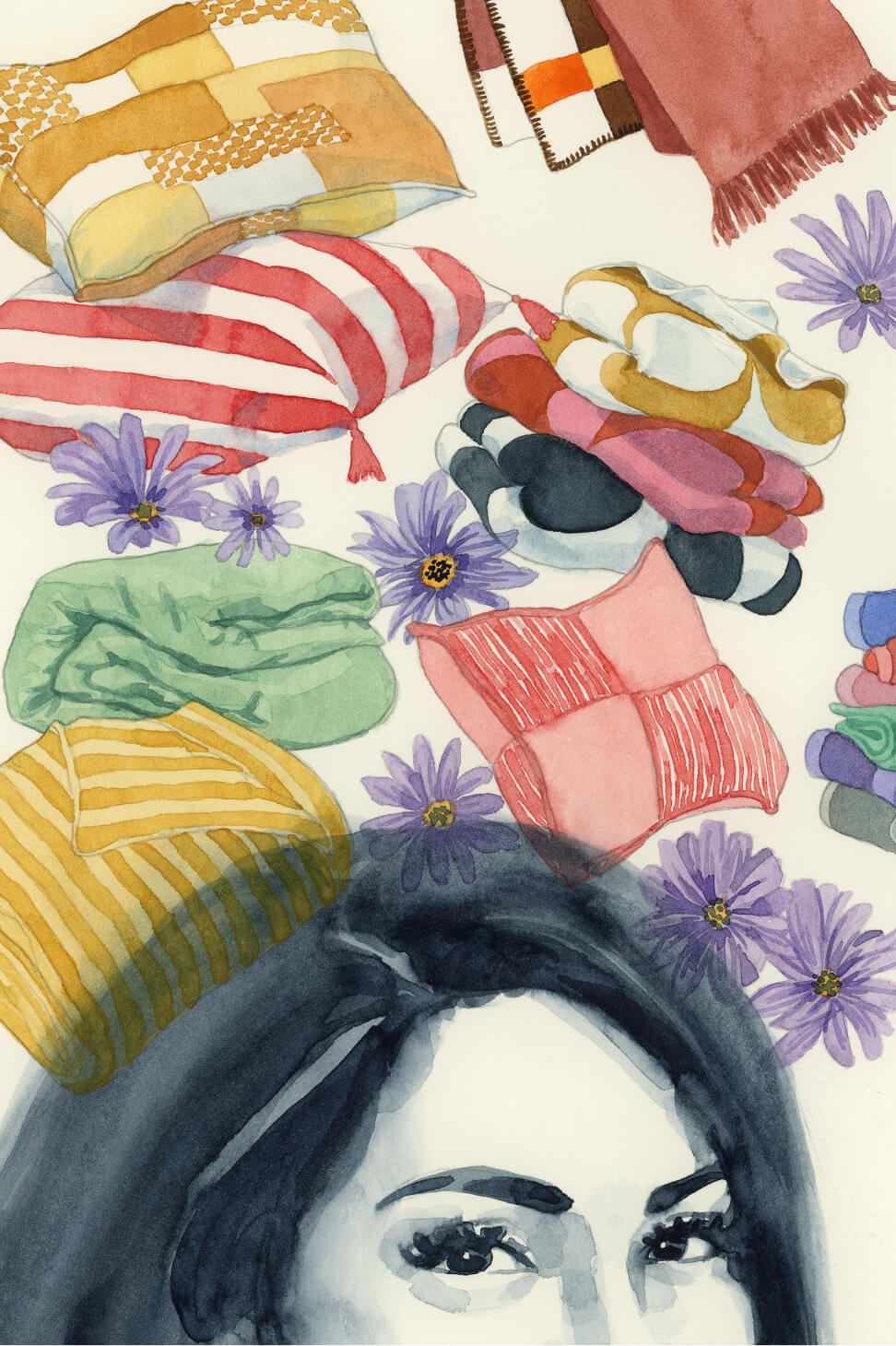
The site Tagwalk, for example, launched in 2024, analyzes hundreds of thousands of fashion show images across multiple brands and organizes them into a trend “dashboard” and searchable database featuring colors, patterns, fabrics, and more. Fashion runways are still a reliable trend source, Panchu says, but social media influencers, international travel images, and social and cultural factors also deserve consideration. With an exhaustive analysis of what’s “now,” what’s next starts to take shape.
For Macy’s, Panchu will do a deep dive into the sales of their private label brands and assemble a color card that displays, for example, all the blues used versus pinks. “Then they can see what their best-selling colors are,” she says. Each brand has tried and true shades that sell reliably each season, but the color card helps them innovate.
Panchu teaches how to make professional mood boards in classes in FIT’s Textile Development and Marketing department, and the Center for Continuing and Professional Studies’ Color Specialist certificate program. Pro tip: “A good mood board doesn’t just show what you like; it shows why it matters.”
So what colors are coming next? Panchu says Cloud White, Pantone’s color for 2026, sets the stage: It’s “a palette cleanser and blank canvas,” she says. “It reflects a world navigating between overstimulation and intentional living.” For 2027, we can expect “a fluid color landscape—restorative neutrals, watery translucence, hyper-digital brights, and saturated earth tones,” reflecting “a collective desire for grounding stability and optimism, balancing comfort with the need for energizing expression.” Keep your eyes peeled. —Alex Joseph
HOW IS THE COLOR OF THE YEAR CHOSEN?
PANTONE VP LAURIE PRESSMAN EXPLAINS
Pantone’s Color of the Year was meant to be a one-off. It was 1999, and the world was grappling with anxieties over Y2K. To spark conversation and highlight the relationship between color and culture, the Pantone Color Institute conceived a “Color of the Year.” They selected Cerulean from their Fashion, Home + Interiors system—a soothing shade meant to evoke the stability and solace of the sky. Fans of The Devil Wears Prada might recognize this exact color from the iconic monologue detailing how such choices quietly penetrate the global market.
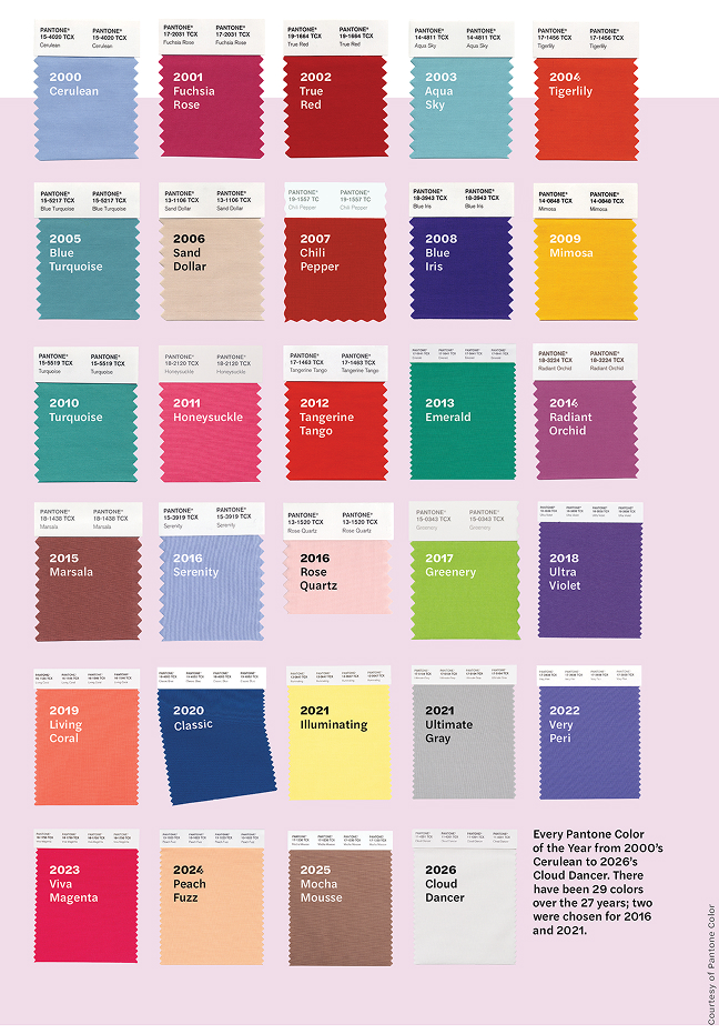
Every Pantone Color of the Year from 2000’s Cerulean to 2026’s Cloud Dancer. There have been 29 colors over the 27 years; two were chosen for 2016 and 2021. Images courtesy of Pantone Color Institute
Capitalizing on the immense buzz generated by Cerulean, Pantone transformed the experimental campaign into an annual tradition.
Today, a global team of experts keeps watch all year for hues that capture the shifting global mood, surveying consumers and analyzing emerging trends. “Influences can come from anywhere,” says Laurie Pressman, a former member of FIT’s Home Products Development advisory board and the vice president at Pantone who oversees the process. “Art and fashion, travel destinations, lifestyles, geopolitical and socioeconomic factors, worldwide sporting events, and social media.” In other words, just about everything.
The team is not just looking for the right color, they are also looking for the perfect name, one that reflects the moment and resonates across cultures. In 2017, the experts loved a particular yellow-green, but its name, Pea Soup, did not transmit the intended message of invigoration and renewal. Instead, they chose a similar shade with a more inspiring name: Greenery.
According to Pressman, the 2026 choice, Cloud Dancer, is an organic natural white that is both versatile and nonseasonal, with a positive, hopeful name. “We’re in this place that doesn’t seem to be working, so we’re looking for a fresh start. We need the simplicity and clarity to move forward in a better way.”
Some critics saw the choice as a stance against diversity, but Pressman insists that the Color of the Year is never about politics but about design. White is a canvas; it is negative space.
Regardless of the response, Pressman appreciates the lasting appeal of the Color of the Year program. “Maybe they loved it, maybe they didn’t love it, but at least they’re talking about color.” —Jonathan Vatner
PHILIP FIMMANO
Fashion Design AAS ’99, forecasts trends with Li Edelkoort
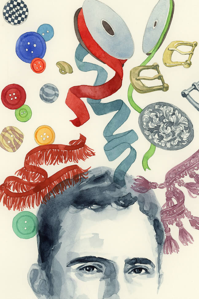
“Trend forecasting is like creating an archaeology of the future,” says Philip Fimmano, partner and analyst at Trend Union, one of the world’s most sought-after forecasting companies.
Fimmano contributes to Trend Union’s predictive studies for international companies in fashion, textiles, interiors, and lifestyle. With Lidewij (Li) Edelkoort, the company’s founder, he also co-launched Talking Textiles, a multiplatform educational textile initiative; co-wrote the design book A Labour of Love (Lecturis 2020), profiles of more than 70 creative studios; and co-created the World Hope Forum, a platform for community building born as a response to Covid-era isolation. This year, Fimmano is co-curating a new exhibition called Inner Child: Playing with Design at Artipelag in Stockholm, looking at how naivete and optimism are influencing interiors and fashion. He also serves as a mentor for trend forecasting master’s degree students at Polimoda in Florence, Italy.
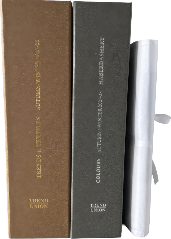
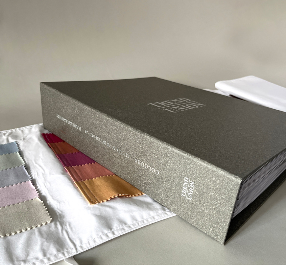
From the description of the Trend Union Autumn/Winter 2027–2028 color forecasting tool:
“Haberdashery will drive the major style movements and co-design trends that are functional and emotional, bringing back codes of dressing up such as button-down collars, buckled belts, pleated rosettes, woolen pompoms, knitted mittens, felted hats, and soft leather gloves.”
Trend watchers are everywhere, but Fimmano distinguishes that from true forecasting. “If trend watching creates a holistic picture of now,” he says, “then trend forecasting is about what the colors and materials will look like two years from now.”
To do this work, he immerses himself in aesthetic and tactile output from a range of industries, but he also gives himself breathing room to step back. “Intuition,” he says, “is a muscle that needs to be trained.” —Jonathan Vatner